Snapr
SnaprApp Themes
This guide is simple: what App Theme is, how it differs from Overlay Theme, and how to make one quickly.
App Theme vs Overlay Theme#
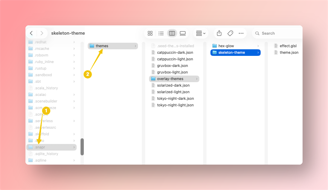
Both use the same custom themes folder:
macOS/Linux: ~/.snapr/themes/
Windows: %USERPROFILE%\.snapr\themes\
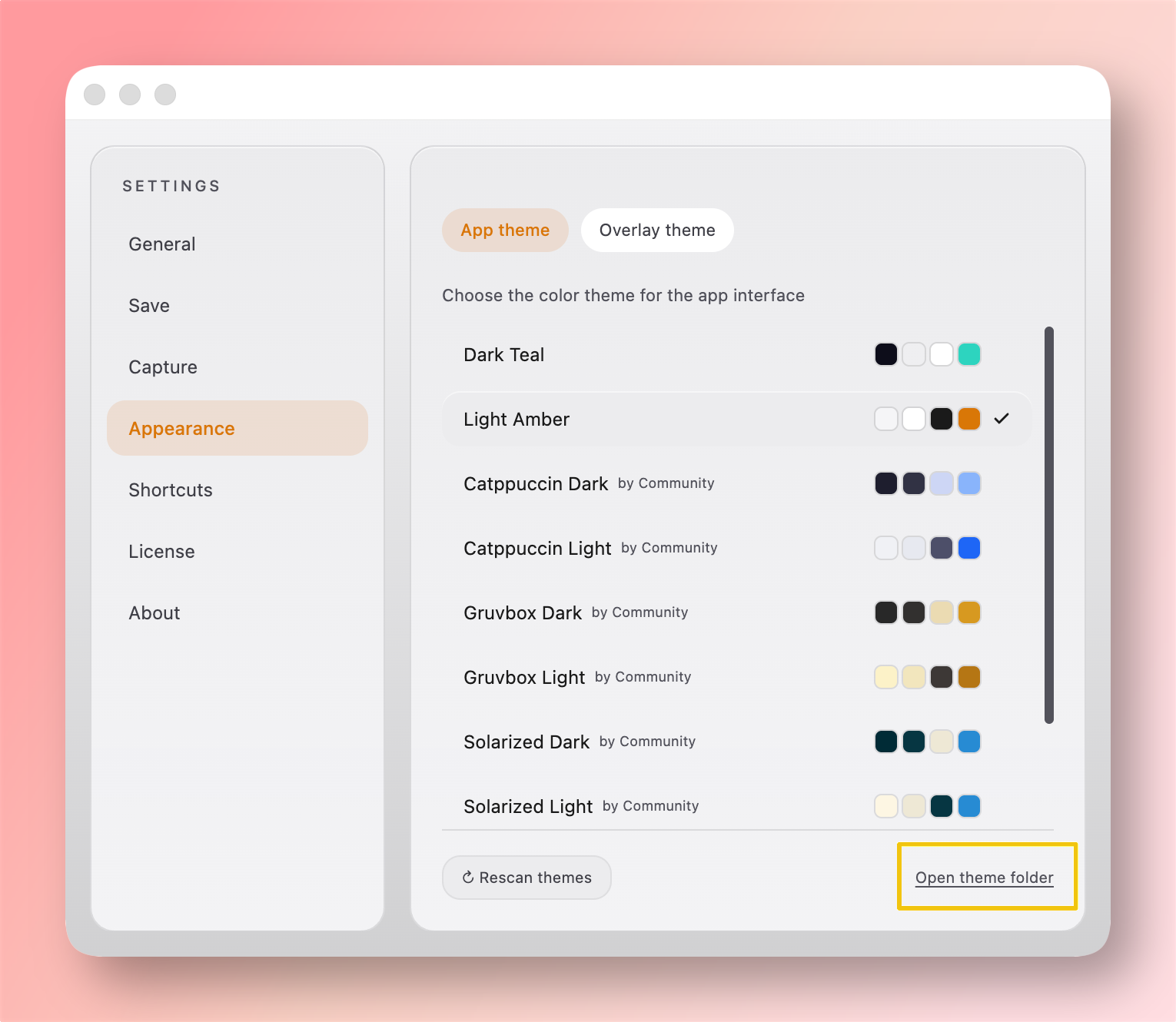
You can also open this folder directly from Settings → Appearance → Open theme folder.
But they control different surfaces:
| Type | What it controls | Typical keys |
|---|---|---|
type: "app" | App UI colors (settings, editor panels, text, buttons, borders) | --color-bg, --color-text, --color-accent |
type: "overlay" | Capture selection visuals | stroke, dimBg, lineWidth, effect |
In short: App Theme is your workspace palette, Overlay Theme is your capture overlay look.
Create an App Theme#
- Create a
.jsonfile in your custom themes folder. - Add required fields:
type,id,name,variables. - Use
schemaVersionas a number (for example:1). - Open Settings → Appearance.
- Click Rescan themes and select your theme.
Example (solarized-dark.json):
{
  "type": "app",
  "id": "solarized-dark",
  "name": "Solarized Dark",
  "schemaVersion": 1,
  "variables": {
    "--color-bg": "#002b36",
    "--color-surface": "rgba(7,54,66,0.85)",
    "--color-text": "#fdf6e3",
    "--color-text-secondary": "#93a1a1",
    "--color-border": "rgba(238,232,213,0.20)",
    "--color-accent": "#b58900",
    "--color-accent-on": "#002b36"
  }
}
Minimal example (accent-only.json):
{
  "type": "app",
  "id": "accent-only",
  "name": "Accent Only",
  "schemaVersion": 1,
  "variables": {
    "--color-accent": "#a6e22e",
    "--color-accent-on": "#272822"
  }
}
Sample Theme Pack#
Sample app themes (including Solarized/Monokai-style variants):
Download app theme samples (.zip)
Drop files into your themes folder and click Rescan themes.